


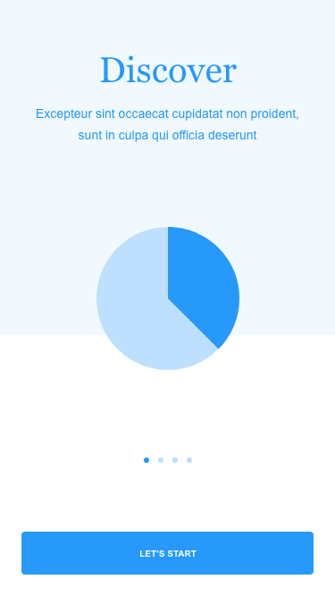
Seeing through users’ eyes and designing a health app concept according to research results.
Design a health app concept that can also be integrated into an online streaming platform.
Client – PELOTON
Roles and responsibilities -
We created the project’s UX/UI with a cross-functional team and executed usability testing, interviews, market research, competitive analysis, and user research with users’ feedback across diverse cultures.
In addition, we designed information architecture according to the user surveys, user interviews, and the research data.
As required, we also establish and maintain excellent business partner relationships, interacting at both the business and technical level.
Additional roles -
· Collaborates with stakeholders and/or business analysts to create user stories and sprint goals.
· Act as the catalyst for digital transformation, promoting a cross-functional focus on design thinking and user experience
· Research new technologies, services, and tools to continually inform the roadmap, build efficiencies and expand offerings
· Model best practices and standards for interaction design, user-centered design thinking, and user experience principles and techniques (advocate for User Experience and Design Thinking).
Team – We worked as a Cross-Functional Team of -
· 2 UX/UX Designers
· 1 Front End Developer
· 1 Back End Developer
· 1 Data Architect
· 1 Hardware Engineer
Project Timeline - June 2nd – August 5th
Overview
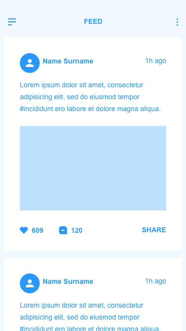
As the starting point for every streaming user, the ‘My Channel' screen has to become an area of discovery. The corporate design of the screen should incorporate scores of ads. Ad platforms can improve upon this experience.
Netflix, Amazon Prime Video, Hulu, HBO Max, Disney +, Apple + could be having challenges with this interface concerning controlling Nielsen's advanced advertising technologies.
Alternative interfaces surface recently watched shows from streaming services directly on the house screen. The feature makes learning from wherever a viewer left off a snap.
In addition, streaming can use the same interfaces to incorporate rotating ads that offer several ad impressions.
A design that highlights and supports the company's advertising business doesn't mean a less user-friendly experience.
Yet, finding ways to assist customers in connecting with new channels, services, and content they may like from the house screen may well be viewed favorably by users.
In addition, acknowledging the program's constraints makes it easier to understand how to redesign it to align with company goals, improve user expertise, and retain simplicity.
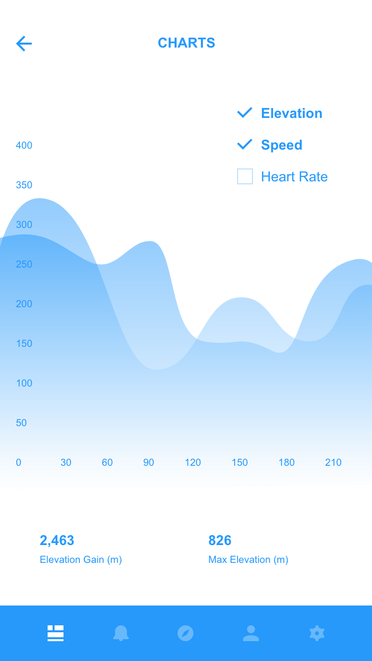
Connecting Your Bluetooth Wearable to Smart TV Health Apps:
With a Health app, you can connect Bluetooth-enabled wearables to the app to see your real-time measurements with every exercise in front of a Smart TV & Tablet.
So, you are giving you real-time results, avoiding looking at a smartwatch or smartphone. Tracking your stats during a session is one of the best ways to see how hard you're training and help track your progress over time.
In addition, you'll be able to take advantage of specific training geared using the Heart Rate Zone methodology. Each zone is based on your maximum heart rate (MHR), and our Heart Rate Zone fitness is tailored to a specific intensity so you know exactly how hard or light you should be working at all times.
The client required our support to understand user needs and design the app concept to improve user experience. So, we set out to fix the usual users’ typical issues by designing an app with an interactive layout and user interface.
The app concept is designed to help Online Streaming, Health, and Fitness users to track their health data and enjoy streaming conveniently and interestingly. The concept offers solutions to the existing challenges and has the essential functionalities to enhance users’ experience.
Goals
· The main objective was to create beautiful screen layouts and unique interactive advertising experiences to delight millions of users worldwide.
· The proposed concept should also meet several dimensions that enable the essential services and enhance users’ experience.
· Have the vision to see the big picture on the macro side while still maintaining incredible attention to detail on the micro side.
· More than the ability to keep the vision while managing the minutiae: Play three-dimensional chess on the axes of what our customers need, such as health apps.
· keeping things as elegantly easy as possible (and no more).
We also wanted to use a few predictive technologies to help users find important contextual features. The concept will address the user’s pain points, resulting in a better user experience. The app’s layout, user interface, and functionalities needed to be designed to better connect with users.

External Challenges
· The primary challenge was to create a user-friendly experience around the app.
· Create design better than existing/competitors’ apps that attract users through a simple and accessible experience.
· Collaborate with product managers and developers to define product strategy and design for quick insights and long-lasting improvements.
· Plan and facilitate discovery/design thinking workshops featuring hands-on activities. Engagingly present all findings, emphasizing the user perspective in a clear, consumable fashion to multiple constituencies: senior-level executives, business stakeholders, marketers, design team members, and technical team members.
· Designs inspirational, useful, and usable experiences by placing the user first while balancing business, Marketing, and technology needs.
Internal challenges
· Key concepts to designing for a TV UI.
· Guidelines and proven design principles used by online streaming when designing UIs
· Encouraging an increase in engagement with UIs that are familiar, functional, and robust
· High customer satisfaction (NPS)
· Best practices for designing Channels (aka apps).
· Projected use of Online Streaming developer program consisting of a diversity of UI components.
· Key features streaming users expect in a good Channel.
· Online Streaming channel certification requirements.
· An online streaming brand represents an expectation of user comfort and quality because of certain UI paradigm-shifting features.
E.g., Support for instant replay buttons and trick mode features.
Users
Online Streaming & Health/Fitness users
Designing process
Creating and following a step-by-step research plan is essential to ensure the research and design process stays on track.
1. Empathy - The first step in the development of an app concept is the empathy phase. It entails observing the market and identifying areas that need improvement or introducing enhanced solutions. So, we empathize with users through user interviews and user research.
User research
To better understand users’ needs, we lead user research through studies, interviews, panels, and surveys; Use a variety of qualitative and quantitative analysis techniques to optimize digital experience continually.
We conducted user research in two parts; Qualitative information research and quantitative data research.
The research will help us dig deep into our understanding of users – not only their immediate frustrations but also their hopes, fears, abilities, limitations, reasoning, and goals. It laid essential foundations for creating solutions in the next stages. To ensure the research stays on track and better guide the design later, we created a series of following questions and began user research.
· Who are the app users?
· What are their goals, needs, frustrations, and motivation?
· What are the key trends and user demographics of health apps and online streaming platforms?
· What are the competitors’ strengths and weaknesses?
Research goals
· Identify the online streaming and health apps users and their goals, needs, frustrations, and motivations.
· Collect user demographic of competitors' audience and potential users.
· Discover key trends in the healthcare and online streaming industry.
Qualitative information research
Firstly, we performed qualitative information research to give ourselves some direction.
We find out users’ current pain points, fears, and needs? We also figured out what motivates or demotivates them from online streaming and health apps.
Interviews with ideal users

We conducted user interviews with potential users to gather qualitative data about their goals, needs, frustrations, and motivations. Through the interviews, we were able to get the participants to share their experiences and stories.
We asked the following questions:
· What kinds of issues are you facing right now?
· What are some of your most significant pain points or gripes while using health apps and online streaming platforms?
· What do you think can improve the overall health app and online streaming experience?
Findings
Currently, users are interested in convenient, accessible, menu-oriented, and friendly interfaces.
The qualitative information research helped us confirm invalid assumptions about users and their expectations regarding health apps and online streaming platforms.
2. Synthesis – We synthesized the qualitative data gathered from user research and interview and worked from users' viewpoints to define the problem that needs to be solved.
Quantitative data research
After qualitative information research, we performed Quantitative data research to learn user behavior regarding the health apps and online streaming platforms.
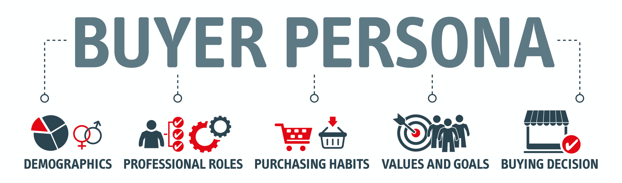
Persona
Based on user research and interviews, we developed a user persona to address the major needs of the targeted audience.
Persona would guide the process and evolution of developing user flows. Therefore, we referred to it throughout the entire designing process.
Market Research
We performed market research to understand the project scope, future trends, and customer demographics. In addition, we studied competitors’ apps and platforms to understand their features and functionalities.
We also analyzed the information structure of several popular online streaming platforms and health apps to understand what information is valuable to users. The idea is to conceptualize the market state and identify a gap that derives opportunities.
Data from market research helped us optimize the app interface according to industry trends and user behavior.
Competitor research
We conducted a competitive analysis to validate our hypothesis and see what competitors were doing in the current market.
The goal was to compare and identify common features across the following competitor apps.
· Amazon Fire-stick
· Netflix
· Hulu
· Roku
· Peloton
· Apple Health
· Fitbit
· Health Apps
· Online Streaming apps
We then Communicated findings and insights to cross-functional partners and leaders concisely and compellingly. Next, we Analyze the data and feedback to make critical design decisions.
What is next
To define the problem, we are going to solve; we brainstormed with all the data gathered from research that allowed us to ideate in a goal-oriented manner and helped us imagine what potential solutions might look like.
After specifying the issues and analyzing each pain stage, we were prepared to produce solutions.
We need to understand user pain points and create an optimized user flow and layout aligning with users’ needs. In addition, we must utilize users’ feedback in the design process to focus on real-life applications. The aim is to focus less on heavy technology and use an open design approach to make content exploration more accessible and visible.
3. Ideation – Generate ideas that might solve the problem and encourage innovative thinking.
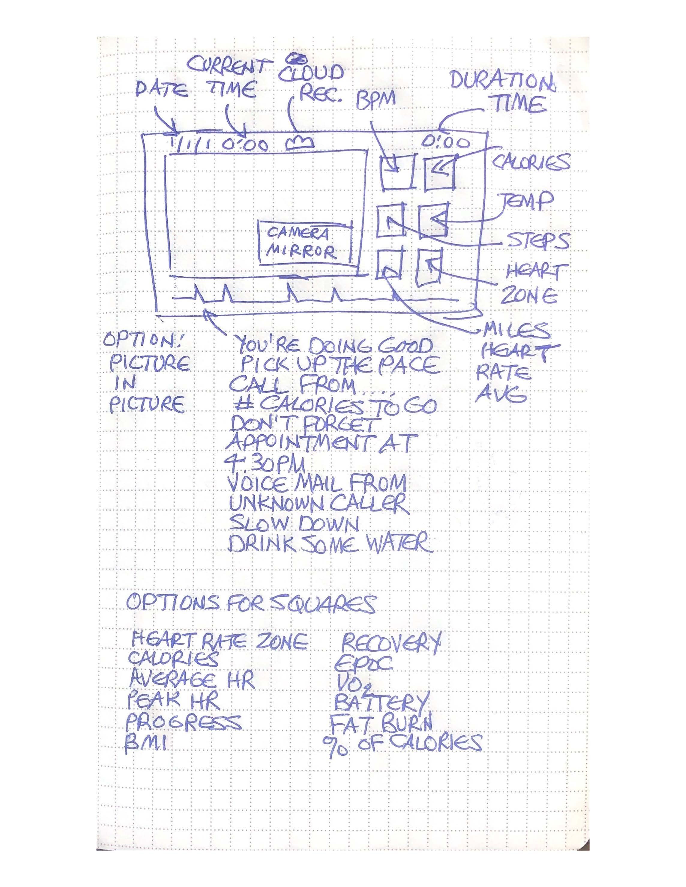
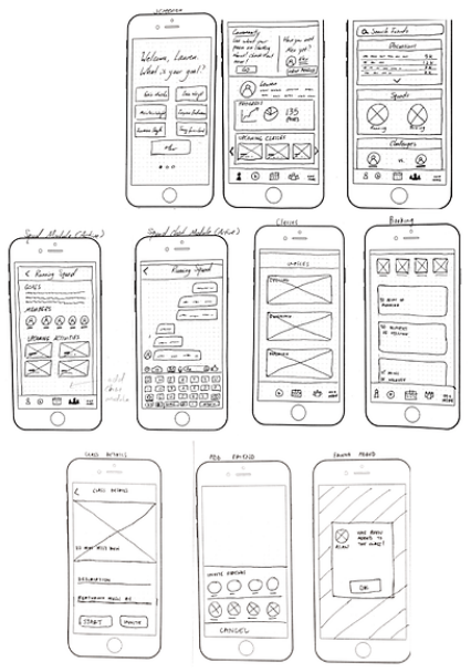
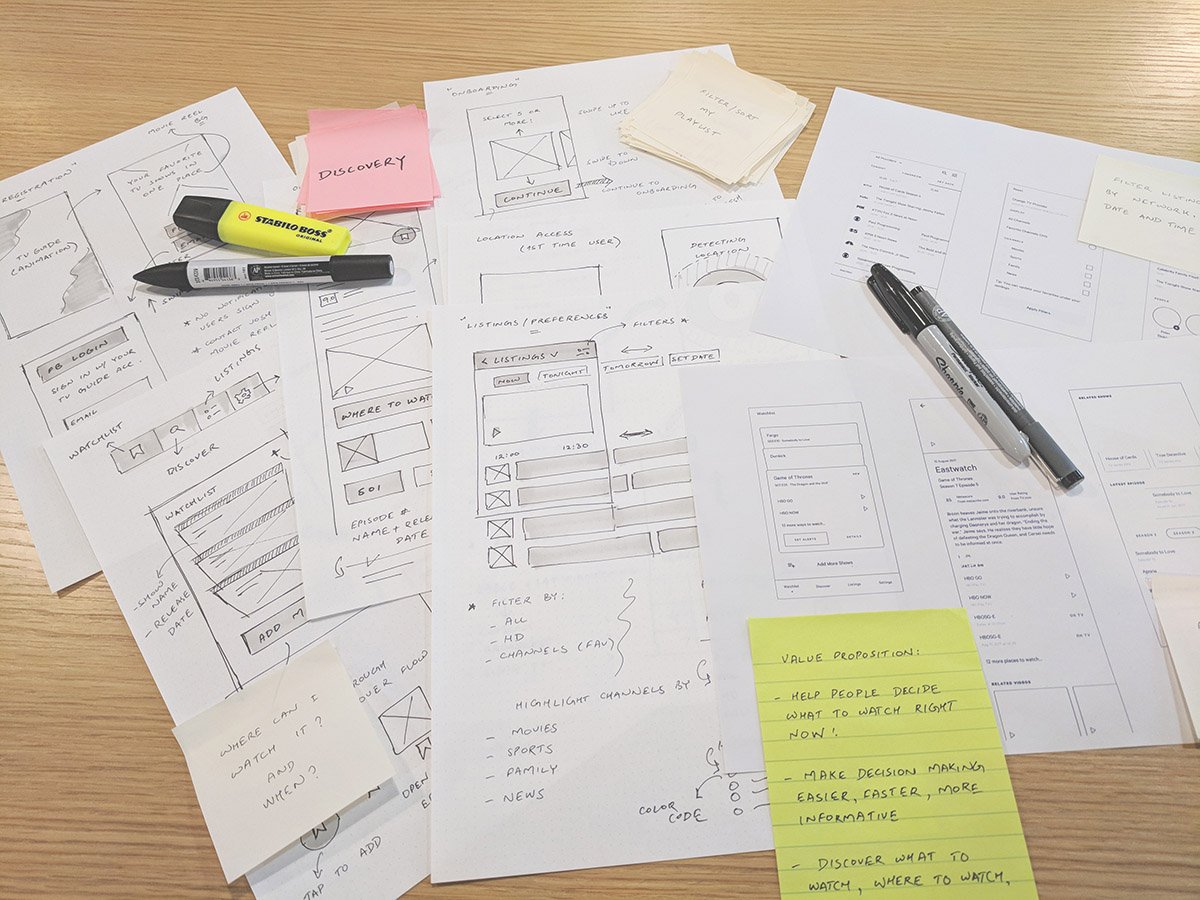
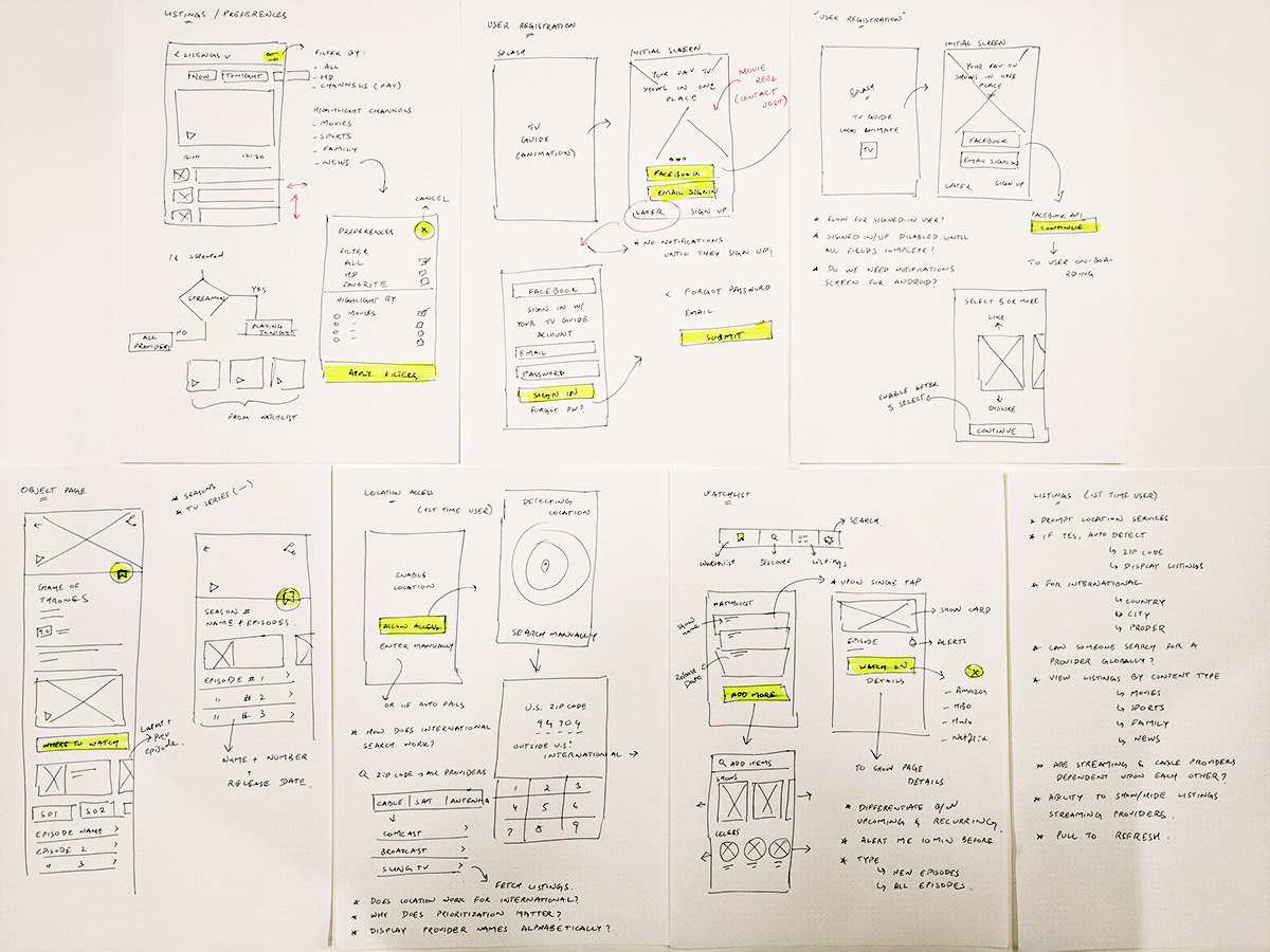
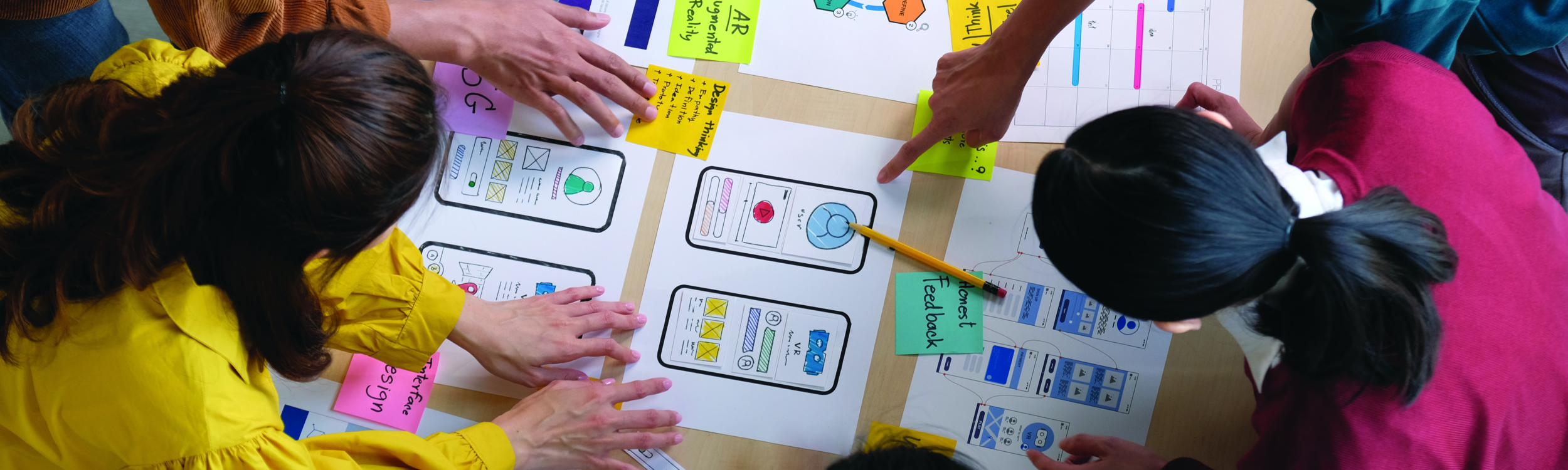
Sketches
By using sketches, we were quickly able to develop how the potential solutions address the user’s needs.
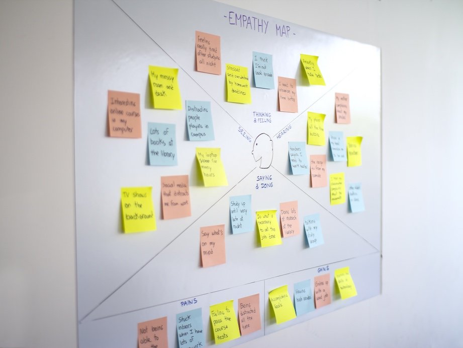
Empathy map
To synthesize the qualitative data gathered from user interviews, personas, and user research. We created an empathy map to identify patterns across users, uncover insights, and generate needs.

“Today’s world generates data at unbelievable rapid rate. It is essential to leverage the available data to understand the bigger picture better. Data Science is changing the world, and user research needs to get on board to understand business and user needs better. User Experience can be a tool that can be essential to frame how data science conveys critical insights.”
User journey and User flow
We mapped out the users’ steps to see how we could simplify their journey and help them reach their most important goals with the health app. Then, based on user research and interviews, we optimize the user journey. Then, we quickly designed flows to understand how users will navigate through the app.

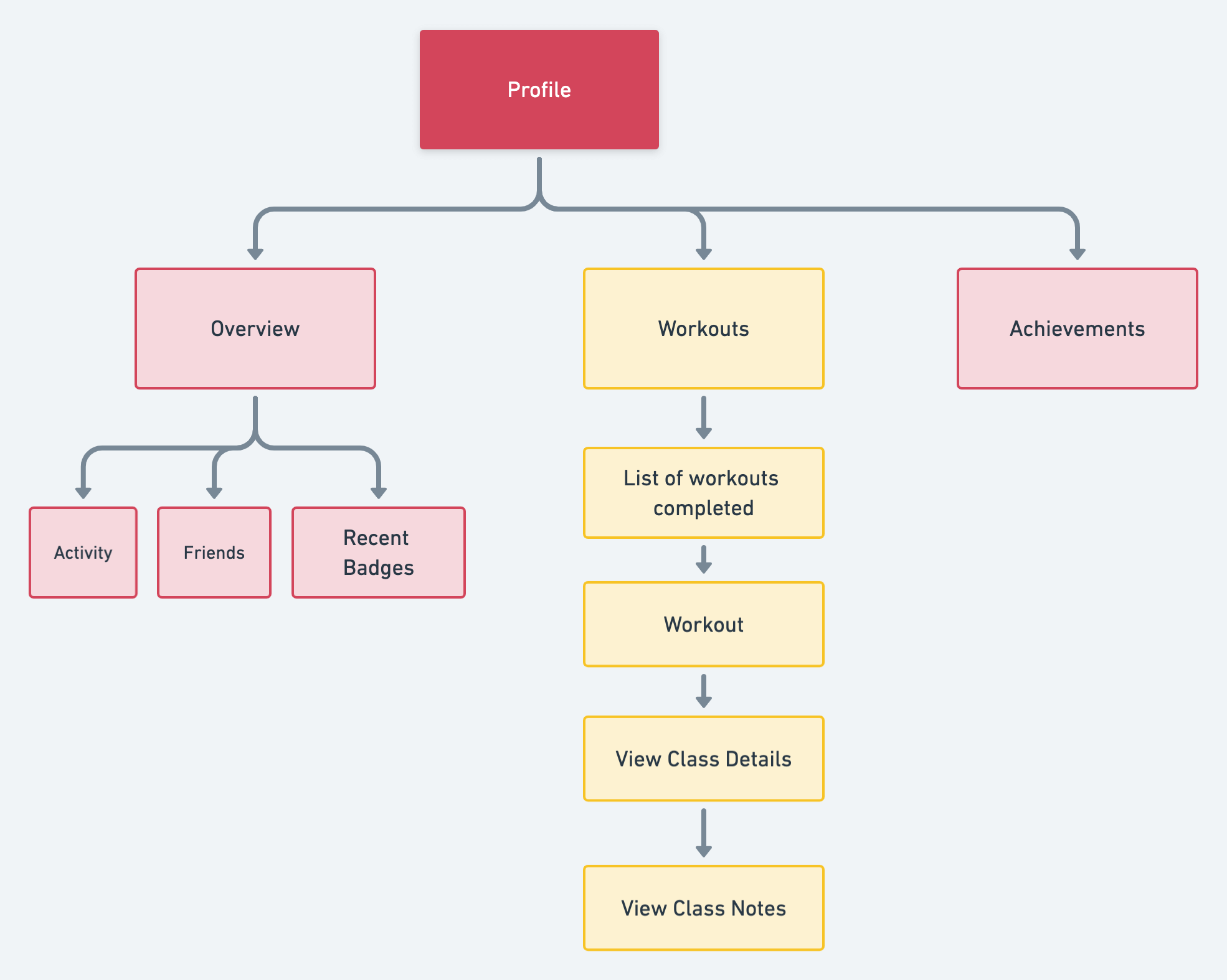
Information architecture
We created an information architecture (IA) utilizing competitive audits, keyword planning, and user navigation testing (e.g., site maps, screen trees, user flows, decision and content tables)
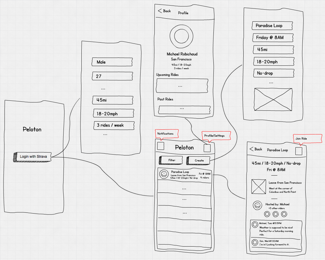
The Peloton architecture is made up of the following components:
Peloton UI: is web-based UI for managing jobs, tasks, volumes, and resource pools in Peloton.
Peloton CLI: is command-line interface for Peloton with similar functionality to the web-based interface.
Peloton API: uses Protocol Buffers as the interface definition language and YARPC as its RPC runtime. Peloton UI, Peloton CLI, and other Peloton extensions are all built on top of the same Peloton API.
Host Manager: abstracts away Mesos details from other Peloton components. It registers with Mesos via Mesos HTTP API.
Resource Manager: maintains the resource pool hierarchy and periodically calculates the resource entitlement of each resource pool, which is then used to schedule or preempt tasks correspondingly.
Placement Engine: finds the placement (i.e., task to host mapping) by taking into consideration the job and task constraints as well as host attributes. Placement engines could be pluggable for different job types such as stateful services and batch jobs.
Job Manager: handles the lifecycle of jobs, tasks, and volumes. It also supports rolling upgrades of tasks in a job for long-running services.
Storage Gateway: provides an abstraction layer on top of different storage backends so that we can migrate from one storage backend to another without significant change in Peloton itself. We have a default backend for Cassandra built-in, but can extend it to other backends.
Group Membership: manages the set of Peloton master instances and elects a leader to both register to Mesos as a framework and instantiate a resource manager.
All four Peloton daemons have high availability guarantees with either active-active instances or leader-follower topology. Peloton guarantees that all tasks are executed at least once, even after any application instance fails. For stateless Peloton daemons like Job Manager and Placement Engine, any instance failure can be tolerated by its built-in retry mechanism.
Responsive Design

Streaming and Data Science. How data will send the platform to the next level? This document highlights Roku's approach to UIs for streaming media, with progressive requirements crucial to passing Roku's channel certification process and developing a sound-crafted Roku channel. Though channels that do not execute all best practices may still include the Roku platform, the procedures outlined below are known to improve the user experience, directly affecting the engagement and value of a channel on the Roku platform.
This Design section describes the following:
• Key concepts to designing for a TV UI.
• Guidelines and proven design principles used by Roku when designing UIs
• Encouraging an increase in engagement with UIs that are familiar, functional, and robust
• High customer satisfaction (NPS)
• Best practices for designing smart TV apps.
• Projected use of Roku's developer program consisting of a diversity of UI components.
• Key features streaming users expect in a good Roku Channel.
• Online streaming platform certification requirements.
• Peloton’s brand represents an expectation of user comfort and quality because of certain UI paradigm-shifting features.
E.g., Support for instant replay buttons and trick mode features.
Wireframes & flow diagrams
We started building screens, buttons, and all sorts of other artwork, trying to create something that looks clean, modern, and simple to use. Then we defined functionality, content, navigation, and interaction models through page-level wireframes and flow diagrams.
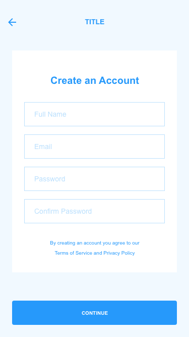
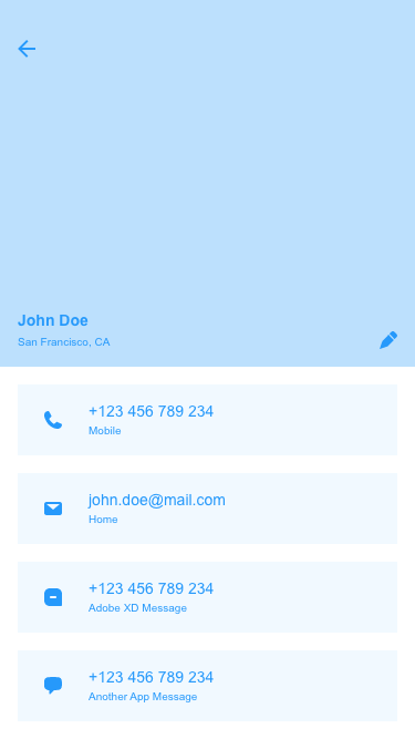
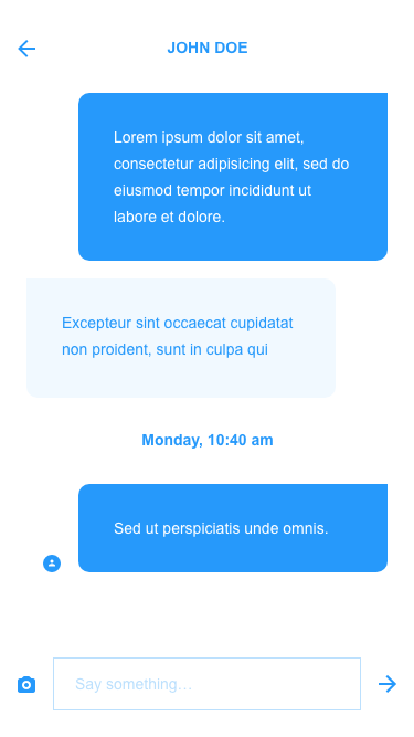
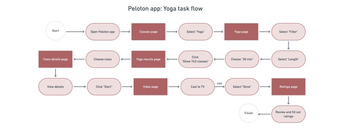
Wireframes helped us see what the app would roughly look like and how it would flow from screen to screen. User research and interviews gave us ideas for what would feel familiar to users.
After multiple design iterations, we finalized a design and started designing the final screens in Adobe XD and Figma.
Prototypes
We created clickable prototypes using Adobe XD and Figma, maintaining interaction and visual consistency to effectively communicate the design strategy. This is considerably quicker than diving into the complex application builds.

Usability testing
We conducted usability testing with ideal users to quantitatively review the usability assumptions, test user-friendliness, and validate the design.
To measure how ‘usable’ the website is, we measured three things:
· Effectiveness - Whether a user can complete a task
· Efficiency - How long it takes them to complete a task
· Satisfaction - How the user feels about the task
The outcome of Usability testing
Participants stated that the overall flow is relatively straightforward, and they can find features and navigate the app seamlessly.
What we learned.
The project is still under Research & Development stages phase. We learned that the adoption of an idea depends on multiple factors, including the features that enhance the functionality of an application.
Coming out with a design based on user research helped us understand a lot. So, luckily, we designed the app with a responsive, simple-to-use, and interactive layout to make the user’s life more delightful.
We followed a light design style because we wanted the project to come off friendly and ultimately not give off a technical “database” vibe. Instead, the design will give users a familiar and delightful experience.
“DAI technology simply means that advertisers will be able to receive “better targeting and measurement” capabilities so they can hyper-target a specific audience instead of more broad demographics like age and gender.”
In-House Ad Media & Finances for Peloton
Today’s world generates data at unbelievable rapid rate. It is essential to leverage the available data to understand the bigger picture better. Data Science & Visualization is changing the world, and user research needs to get on board to understand business and user needs better. User Experience can be a tool that can be essential to frame how data science conveys critical insights.
Artificial Intelligence
With today's Advanced Video Advertising Unit, it's only a matter of time that face recognition or facial recognition becomes a contributor as it is already one of the largest research areas within computer vision. It gathers datasets and benchmark information for large-scale multi-modal face anti-spoofing such as FaceNet. They use a deep convolutional neural network that optimizes the embedding rather than using an intermediate bottleneck layer. This method becomes essential in the end-to-end learning of the system. Advertisers want to be highly targeted, so the more scale you bring, the more meaningful it is to a brand or an advertiser. It is creating a dataset for recognizing faces across pose and age. Artificial Intelligence tools are becoming available on cloud-based platforms have proven super valuable for the clicking, editing, storing, sharing, and filtering of images and video streaming.


The first thing I would do is uncover more about the Fortune 200 partners. I would do a deep dive to determine the following:
-KPI’s (key performance indicators)
-Client Needs/goals (uncover what is needed by each partner to fulfill requests)
-Design Thinking to make sure we are building out based on the target demo research
-Functions are needed as well as the type of positions they are creating.
-Getting a feel of the type of structure needed to do the task by understanding client needs.
We would then take the roles and put them into buckets to create a concept based on qualifications. Once that is done then we will start formatting based on the positions. Again, because they are internships, the jobs would be very similar in scope but would vary slightly, and again based on what the client needs, we would customize if the position had more skillsets needed.
Basing the need of each partner is where I begin to take action. I would speak with VP marketing at both partners, internal digital team and make recommendations if there is anyone else I should talk with to help fulfill the task.
Because the details could be great with each partner, I would format the need to generalize the elements, not overwhelming for anyone. The need to fulfill that design won’t build many positions based on fulfilling one job but thousands.
I would respond by asking to set up a detailed meeting to understand the KPIs needed for the clients. I wouldn’t involve too many people because that could complicate the process and slow down the assignment. I also would bring in the VP of marketing at 33% of the job completion to see the process and make changes, then again at 70%, and finally at the conclusion. The progress assures that there are no changes that would take more time to complete the task.
I would seek to understand all the metrics needed for the assignments and connect with the VP of marketing and my internal digital team.